Term 2
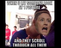
The point of this project was to Photoshop our faces onto someone else in a different picture. I put Hillary Clinton onto a funny picture because i thought it would make it funnier. I learned how to use correct filters to merge two pictures. We used our faces and fixed the filters to make it look right. i sort of rushed so it doesn't really look good. I thought this one was interesting because we got to try something new in Photoshop and now i know how to merge pictures together using faces or other objects to make it look like they were there in the first place. This made it kind of comical because of the text so that made it a little bit less stressful.
This was an 8x8 album cover that we put together with different brushes and fonts. We put the lyrics on the back, not all of the lyrics, just some. I chose Kiss With a Fist by Florence and the Machine. I chose this song because it got stuck in my head and so that all i heard in my mind while i was creating it. I used brushes from Brusheezy.com and made it look like space in the background. The boarder it made with a faded brush. This was one of my favorite projects because it was good to go completely creative with it and I'm happy with the outcome. It kind of looks like a galaxy in the background with the firework brushes, i also used the eraser and erased the white background and it left little dots that looked like stars in a galaxy.
This was another album project similar to first one in the aspect of the brushes and lyrics on the back. Except we were assigned a song by Mr. Adams. I was assigned knocking on heavens door by Bob Dylan. We also needed a copyright sign with our initials on the back. This also was supposed to be a collage so i used pictures that were associated to the lyrics on the back such as blood, sheriff, heaven, door, thunder, and a gun. This one was difficult for me even though i know the song, i realized half way through doing it that i needed to do a collage, that's why there are other pictures floating around the side. I used other brushes from the website for brushes and got some cloud ones and used them for the background with a blue-ish color.
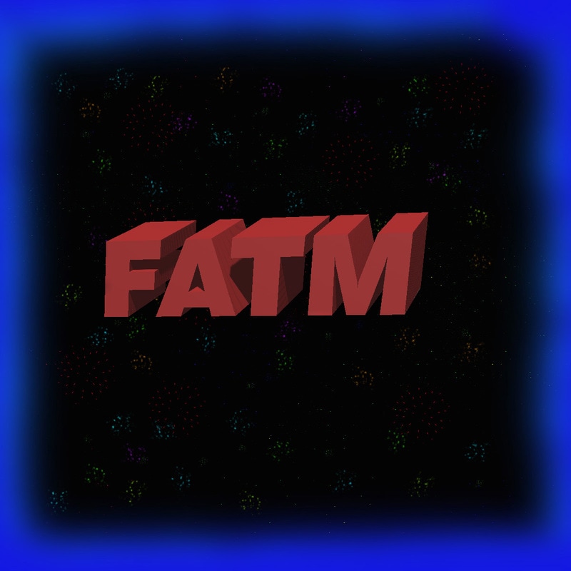
This was the design for the T-shirt project, it had to resemble the album that we did before. I used different brushes on the black back ground that resembled fireworks. I also used the 3D text for the band name FATM. I also used a faded brush for the blue boarder, this kind of made the dark background pop a little bit. The little bits in the back were made using the eraser tool that left pieces that looked like stars in a galaxy. i really liked this project because it allowed us our creative freedom and we got to make something we might use like a T-shirt or pillow case. My T-shirt was kind or messed up but that's ok because now its an example of what not to do.
