Term one
What is this???
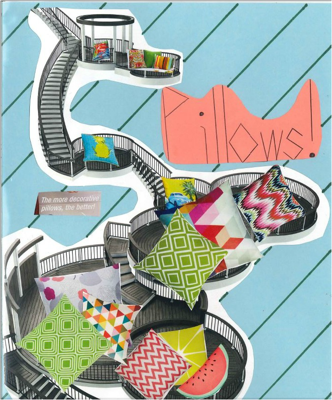
This is a magazine ad that we made out of clippings of other ads. It was made to promote a certain idea and the idea that i chose was decorative pillows. We had specific criteria to fill in in this ad. There was line and color. Line was meant to lead the readers eye along the page, i used the stairs to lead the eye to all the different types of pillows. Color wasn't to hard to fill because almost all decorative pillows are very colorful.
We learned how to be resourceful by looking through the magazine and finding appropriate pictures and text. We also learned how to make our own website (as you can probably tell). We also learned how to use the scanner to convert our physical ads into digital pictures like the one above.
We learned how to be resourceful by looking through the magazine and finding appropriate pictures and text. We also learned how to make our own website (as you can probably tell). We also learned how to use the scanner to convert our physical ads into digital pictures like the one above.
This was a flyer project that we completed. The idea was to create a windshield flyer to put on a car to promote a certain idea or event. The first is an ad for the somerset music festival, i used a template for this one as it is said in the rubric. The next was made from a blank document and has the setting and contact information like all the flyers needed to have. The last one was a replica of the blank document but it was in black and white, so we needed to make more elements and principles of art stand out. Two out of the three flyers needed to be Halloween themed so i made the flyers about a Halloween party on the 29th.
This is a brochure that we worked on, we had to choose a business to create and make a brochure for it. We had to insert a picture of ourselves that we edited from Photoshop. Then we had a biography section next to the picture that explained us and why we created the business. Then we needed to have a contact me page where we would put our emails and phone numbers. (they didn't have to be real) The there was an extra page for more information that we could literally put anything there. Since i chose a traveling agency i picked popular destinations to put on the extra page.
This project was meant to be a greeting card sent by a celebrity to you. I chose a photo of Demi Lovato because it was funny and easy to manipulate in Photoshop. Then we needed a photo of the celebrity to be modified in Photoshop using five tools. I lowered the brightness in the image , i increased the contrast. I removed the background. I colored the background with green and polka dots. And finally i used a filter to shrink her head and stretch her forehead. The reason i called her Poot was because that photo is one of the worst ones of her out there and her nickname was Poot for the image taken by a fan.
This was a project on a field trip that we went on for Thayer Street. The trip was fun and on the trip we were supposed to take pictures of our category, my category was gifts, i took pictures of the best gift shops i could find. We also needed to Photoshop the images a bit to make them look better, i increased the contrast on some and brought up the brightness and i made one of the images black and white. We also needed to put the images into a brochure along with some info on the places.
